Sigma
Date:
Aug 7, 2024
Clients:
Nora Williamson
Project Overview
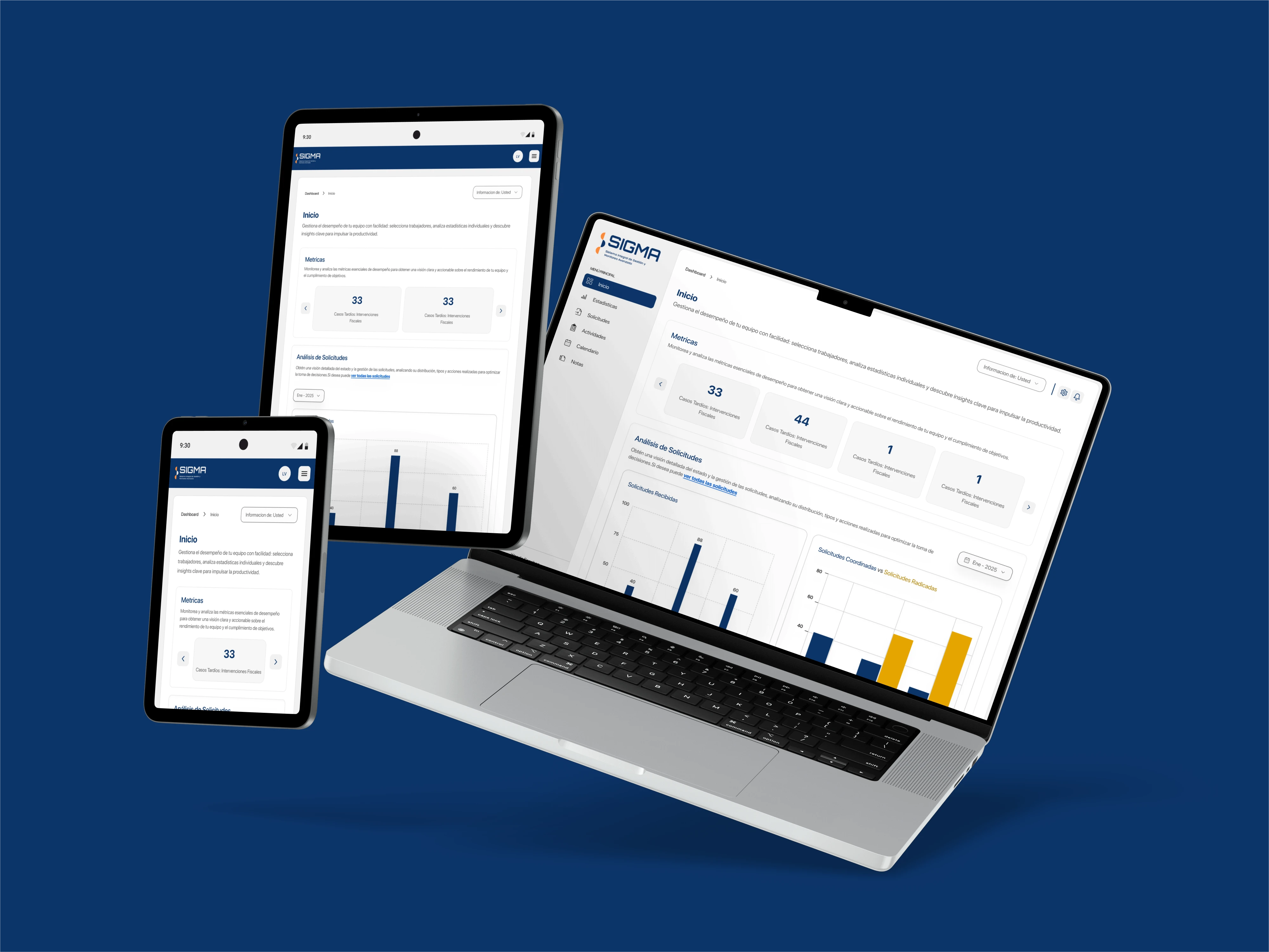
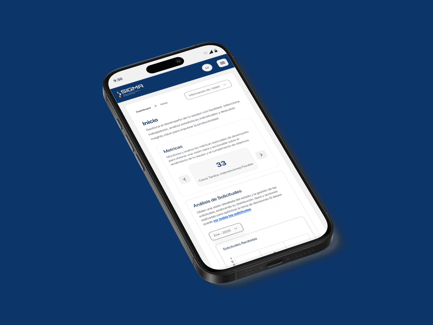
The Operational Monitoring Platform is a system designed for supervisors managing pension requests, providing tools for deadline alerts, metric analysis, and report generation. Its primary goal is to optimize management and accelerate the request issuance process, minimizing delays and bottlenecks.
My Role
As a UX Designer, I was responsible for user research, information architecture, interaction design, wireframing, prototyping, and usability testing.
User Research & Key Insights
To understand supervisors’ needs, I conducted interviews and analyzed existing processes. Key challenges identified:
Lack of visibility on requests nearing deadlines.
Difficulty prioritizing critical requests.
Inefficient processes and long waiting times due to decentralized information.
Competitive Analysis
I examined government benefit management systems and BI platforms (such as Tableau and Power BI), which helped identify best practices for data visualization and decision-making.
UX Strategy & Information Architecture
Based on research insights, I structured the platform with a clear information hierarchy and user flows to ensure efficiency:
User Flow
Alert System: Real-time notifications for urgent requests.
Dashboard Overview: Centralized tracking of all requests.
Data Analytics & Reports: Insights into processing times, delays, and bottlenecks.
Integration with Existing Systems: Ensuring compatibility with SABI (legacy pension management system) and SUABPP (new system).
Wireframing & Prototyping
Using the defined user flow, I created low-fidelity wireframes to map the interface and validate navigation. Interactive prototypes in Figma were tested to refine usability.
Design System
To ensure consistency and usability, I developed a scalable design system with:
Readable, supervisor-friendly typography (legible for quick decision-making).
Neutral and structured color palette (enhancing clarity and prioritization).
Data-driven UI components (charts, tables, and filters for fast insights).
Usability Testing & Iterations
I conducted usability tests with supervisors to validate efficiency and clarity.
Key Findings & Improvements
✅ Simplified navigation: Improved filter system for request tracking.
✅ Enhanced readability: Adjusted dashboard layout for faster data interpretation.
✅ Optimized notifications: Refined the alert prioritization logic.
Final Outcomes & Learnings
Through a research-driven and iterative approach, the platform successfully achieved:
✔ Improved efficiency in request management.
✔ Better prioritization of critical cases through alerts and reports.
✔ Data-driven decision-making with real-time analytics.