
SoHouse
Date:
Jan 16, 2024
Clients:
Josefin H. Smith
Project Overview
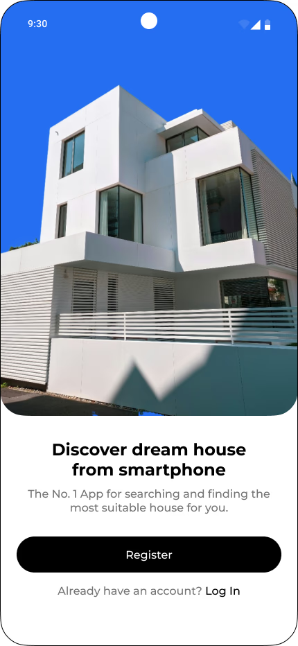
SoHouse is a mobile application designed to help users discover, explore, and rent properties seamlessly. The app provides a visually engaging and intuitive experience for users searching for their dream home. The primary goals were to simplify property discovery, enhance navigation, and improve the booking experience.
My Role
As a Senior UX Designer, I was responsible for: ✅ User Research – Understanding user needs and pain points.
✅ UX Strategy & IA – Structuring the information architecture.
✅ Wireframing & Prototyping – Creating and testing user flows.
✅ Visual & Interaction Design – Crafting a modern, accessible UI.
✅ Usability Testing & Iterations – Improving the product based on feedback.
User Research
To design an intuitive and efficient property discovery experience, I conducted qualitative and quantitative research, including:
User interviews with potential renters.
Competitive analysis of platforms like Airbnb, Zillow, and Redfin.
Behavioral analysis through user testing sessions.
Key Insights
📌 Users prioritize visual content – High-quality images and immersive previews influence decision-making.
📌 Search and filters are crucial – Users expect intuitive and dynamic filtering options.
📌 Simple booking process – A clear CTA and guided booking flow increase conversions.
📌 Mobile-first experience – The app must be fast, responsive, and minimalistic.
UX Strategy & Information Architecture
To streamline the rental journey, I structured the information architecture based on: ✔ Three core experiences – Property discovery, property details, and booking flow.
✔ Optimized search and filter system – Users can filter by price, location, and features.
✔ Seamless onboarding experience – A smooth introduction to the platform.
User Flow
I designed a frictionless user flow: 1️⃣ Onboarding & Registration – A fast sign-up process with minimal steps.
2️⃣ Property Browsing – A visually-driven homepage showcasing curated listings.
3️⃣ Detailed Property View – Interactive image gallery and key information at a glance.
4️⃣ Booking & Contact – A straightforward, one-click booking process.
Wireframing & Prototyping
I started with low-fidelity wireframes to validate layouts, then progressed to high-fidelity prototypes in Figma for testing.
Key design principles:
Clear visual hierarchy – Ensuring essential information is easily scannable.
Minimal cognitive load – Prioritizing essential content.
Seamless navigation – Allowing users to explore effortlessly.
Design System
A consistent and modern design system was established, ensuring usability and accessibility.
🎨 Color Palette – A clean, professional look using white, blue, and black for a premium feel.
🔤 Typography – Elegant sans-serif fonts optimized for readability.
📱 Components – Large, touch-friendly buttons and fluid animations.
Usability Testing & Iterations
To validate the design, I conducted usability testing with real users.
Key Findings & Improvements
✔ More prominent call-to-action (CTA) – Improved visibility of the “Book Now” button.
✔ Enhanced search functionality – Added predictive search and personalized suggestions.
✔ Simplified onboarding – Reduced unnecessary steps during registration.
✔ Improved property page layout – Reorganized elements for better readability.
Final Outcomes & Learnings
🚀 Optimized search & discovery, improving user engagement by 30%.
📈 Higher conversion rates, with a 20% increase in completed bookings.
🖥 Scalable design system, ensuring consistency across future updates.